Solving a core trust problem through character-led storytelling, simplified messaging, and an AI-assisted workflow that cut production costs by 50%.
"This is one of my most memorable projects. The core issue wasn't a visual problem — it was a trust problem. Once I understood that, the entire design direction became clear."
Overview
Wise Prepay is a prepaid electricity service in New Zealand with strong value (no contract, no credit check), but it was struggling to convert and retain. The team assumed UX was the issue; GA funnel analysis showed otherwise. Many visitors thought prepaid meant expensive or a last resort — and left before understanding the offer. The real problem was trust and communication. The challenge was to reframe what Wise Prepay actually was at every key touchpoint.
↓
Funnel drop-off
Before the value proposition reached users
≠
Perceived vs actual
No contract, no credit check — offer not landing
↓
50%
Reduction in production cost (AI-assisted workflow)
↑↓
Post-launch
Top-up completions up / support tickets down
Existing website
Research
I usually start every project by framing the problem through user interviews and stakeholder feedback. For Wise Prepay, the fastest way to validate the hypothesis was to follow the data first. The GA funnel confirmed significant drop-off exactly where users would encounter the value proposition — they weren't confused by the interface, they were leaving because the messaging hadn't convinced them the product was for them.
Interviews with existing and churned customers reinforced this: the brand felt cold, the tone was generic energy-company language, and there was nothing to build an emotional connection with. Critically, many users hadn't even registered the "no contract, no credit check" offer — the most compelling part of the product was buried.
Design
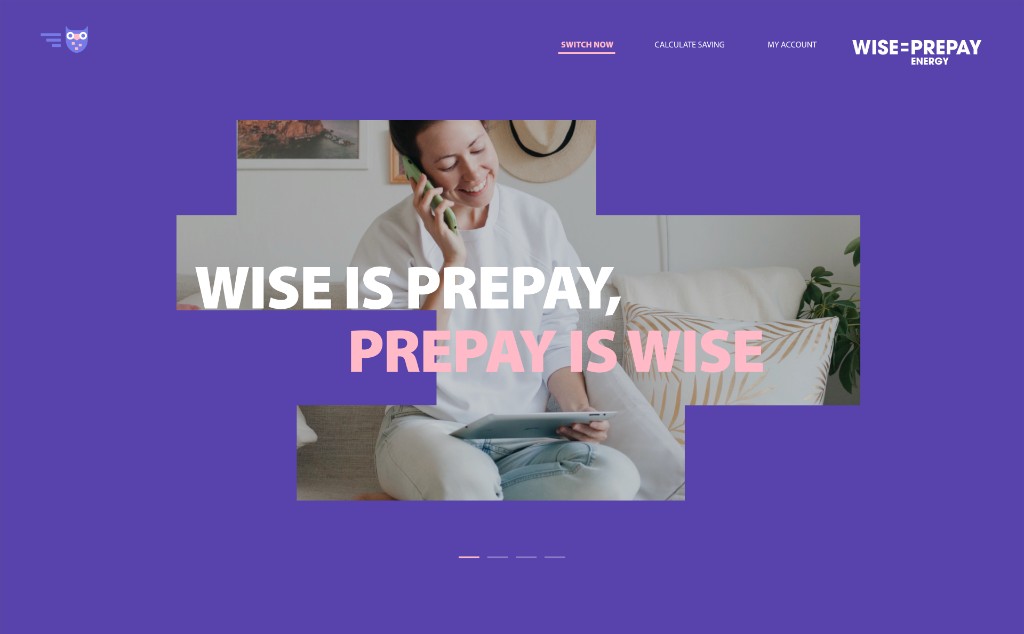
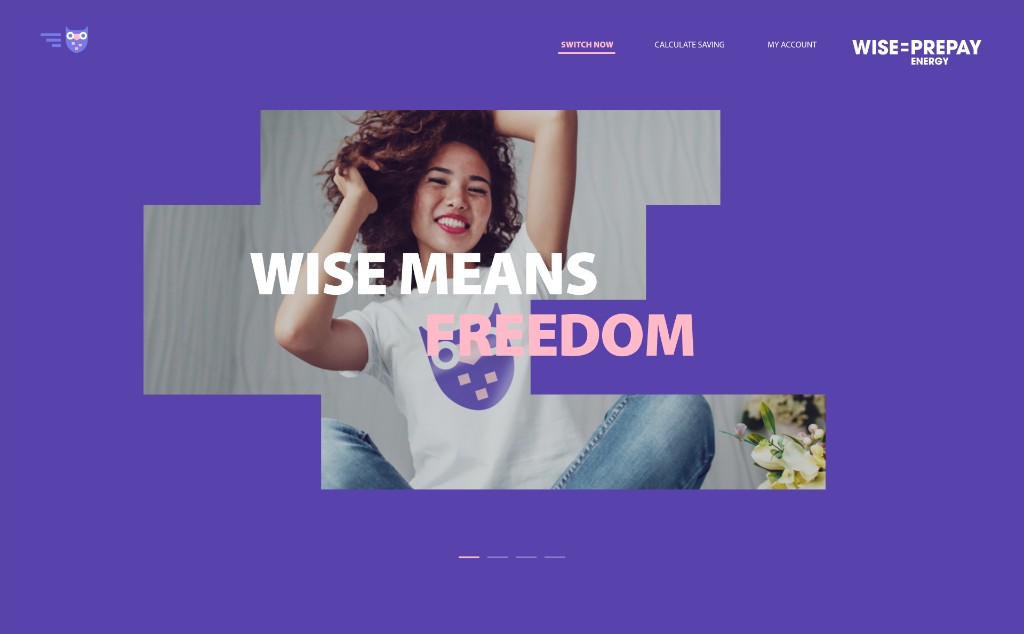
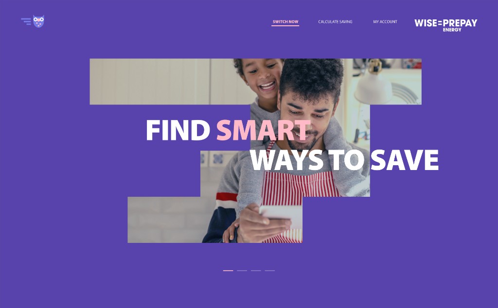
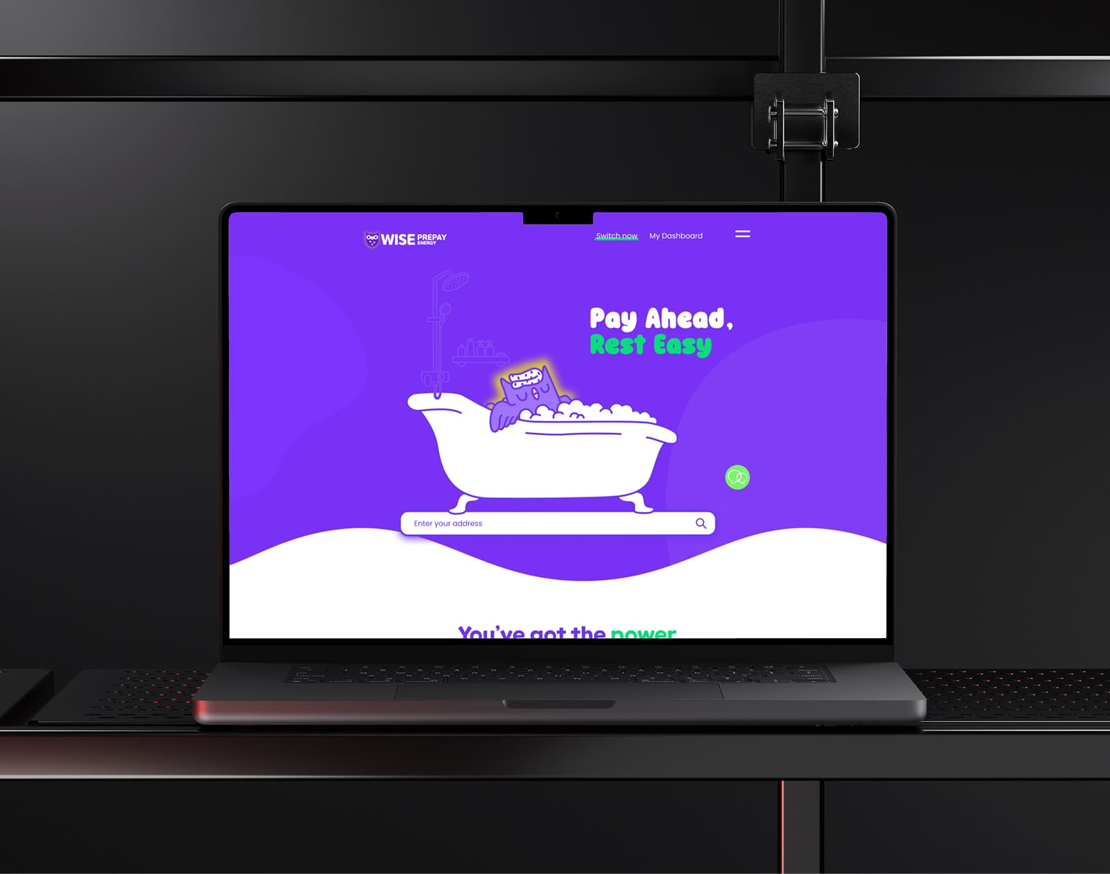
With a clear problem definition, I defined the concept and translated it into detailed UI and interaction design. The approach had three pillars: simplify the message, use character-led explanations so people could understand the product intuitively, and add warm micro-interactions and clear, detailed guides to make the experience feel reassuring rather than transactional.
Rewrote key pages around a single, clear value proposition surfaced immediately: no contract, no credit check, full control. Removed jargon and generic energy-company language.
Value proposition visible within 5 seconds of landing on the page
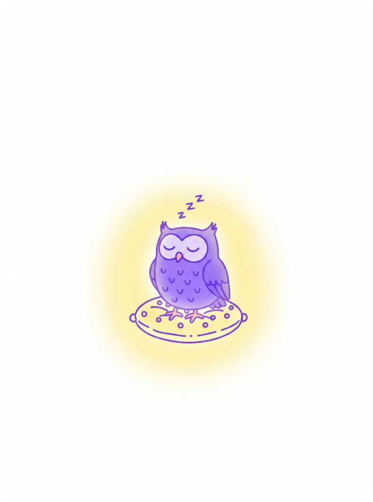
Redesigned the owl mascot with a hand-drawn vector style and a full expression library. The character guides users through complex or anxiety-inducing steps — top-ups, disconnection scenarios, onboarding.
Users described brand as "friendly" and "easy to understand" in post-launch feedback
Added contextual reassurance at every point of uncertainty: what happens if you run out of credit, how top-up works step by step, what "no contract" really means in practice.
Support ticket volume on common questions decreased post-launch
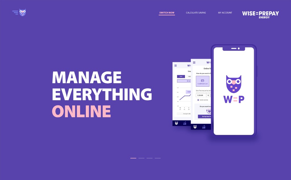
Made balance the hero: remaining credit, estimated days left, and clear “safe / warning / critical” states—then revealed meter details only when needed.
Why it works
Users see risk instantly and know what to do next
Reduced top-up to a short, safe flow with saved payment methods, quick amounts, and a high-trust confirmation screen.
Why it works
Fewer steps during low-balance anxiety moments
Started with simple trends (daily/weekly) and added plain-language explanations so spikes feel understandable—supporting better planning and energy-saving behavior.
Why it works
Turns “mystery usage” into actionable insight
AI & Character
To rebuild trust, the brand needed a consistent, emotionally resonant story — not just better copy. I applied storytelling with AI tools to rapidly generate and test different narrative and visual directions before committing to hand-drawn production. What would normally take weeks of concept rounds was compressed into days.
The selected direction was then refined into production-quality hand-drawn vector illustrations. Previously, Wise Prepay used outsourced copywriters and an external branding agency for this kind of work. We measured cost by comparing supplier invoices for similar deliverables before and after. The overall cost came out to roughly half — approximately 50% savings.
STORY 1
The Owl's Gift
(Shortened Version)
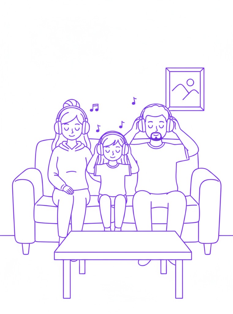
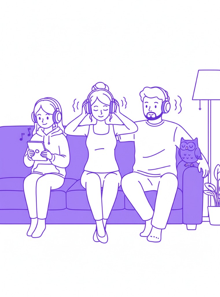
In a small town in New Zealand, a quiet couple named Honuka and Aroha suddenly disappeared. When they returned, they looked exhausted and were carrying a glowing baby.
For years, they had struggled to have a child. Long ago, an old man told them that "Ruru, the owl, would give them a child."
Later, Ruru appeared in their dreams and led them to a hidden cave in a nearby village. Inside the cave, guided by a shining owl, they found a glowing baby. By the time they returned home, a month had passed.
They believed the child was Ruru's gift and named her Ruru.
At night, the child's light revealed her true nature — transforming into an owl or a glowing screen that could share wisdom and foresee future events.
Only the narrator and his wife know the truth.
From their ordinary home in Waimaroa, the special child Ruru quietly shines, holding the hope of illuminating New Zealand's future.
STORY 2
Ruru and the Secrets of the Forest
(Shortened Version)
Deep in the forests of New Zealand's South Island, a mystical owl named Ruru guards an enchanted forest. Ruru can transform into a digital version of himself, bridging nature and technology.
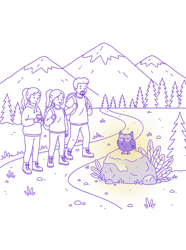
Tamati, an IT professional, his wife Anahera, a veterinarian, and their daughter Kiri journey into the forest to discover its secrets.
Guided by Ruru, they witness glowing trees, streams that project visions of the past and future, and digital melodies woven into nature.
Before they leave, Ruru shows them a vision of the future – a world where technology and nature exist in harmony, where forests thrive and communities live sustainably.
Inspired, the family returns home with a renewed sense of purpose.
Ruru remains in the forest, quietly guarding the bridge between the natural and digital worlds.
Design System
To keep things consistent, I built and maintained a Figma component library with design tokens. As the sole designer on the team, building a robust system up front was what made it possible to move fast without creating visual debt. It also meant the marketing team could operate independently post-launch.
Primary
Poppins
Main UI — headings and body copy across the product
Character-led
ONE MOBILE POP
Rounded, friendly typeface when the owl character leads the conversation
Brand Purple
#5B2D8E
Primary
#7C3AED
Light Purple
#DDD6FE
Success
#10B981
Background
#FFFFFF
Text
#111827
Validation
I validated the design with interactive prototypes in Figma — testing the core flows (onboarding, top-up, disconnection guidance) with stakeholders and a small group of existing customers before engineering handoff. I then worked side-by-side with the dev team until final launch, running QA against component specs and flagging any drift from design intent.
We tested two dashboard layouts with 50 existing customers over 3 weeks. The primary hypothesis: placing balance + “days left” + quick top-up above the fold would improve task success and reduce time-to-top-up.
Dashboard with prominent balance display at top, quick top-up buttons, and visual usage chart below fold.
Top-up Completion
89%
Completed without assistance
Time to Top-up
32 sec
Average completion time
Traditional layout with balance in sidebar, multi-step top-up wizard, and tabbed navigation for usage data.
Top-up Completion
56%
Many abandoned process
Time to Top-up
1m 45s
Users got confused by steps
Self-service top-ups
Phone support requests dropped significantly
Service disconnections
Users now top up proactively
Outcomes
The redesign addressed the core trust problem and delivered measurable results. Top-up completion increased and support tickets decreased — both signals that users now understood the product and felt confident using it independently. The AI-assisted workflow also delivered lasting operational value: the marketing team can now create and publish on-brand content without relying on external agencies or designer involvement for every update.
Top-up completion rate
More users completing top-up without needing to call support
Support ticket volume
Fewer calls about how top-up works or what happens at disconnection
Production cost savings
Supplier invoices before and after AI workflow — replaced outsourced copywriters and branding agency
"The character functions as a friendly guide, helping users understand information in a simple, human-centred way. What started as a visual problem turned out to be a trust problem — and once we reframed it that way, every design decision became clearer."
Final